From White-Label Constraints to User-Driven Innovation
The EVgo driver app is a case study in human-centered design and a true zero-to-one product launch. We invested hundreds of hours in customer research—not in conference rooms, but at charging stations, watching real users struggle with real problems. We interviewed dozens of EV drivers, from first-time Bolt owners to experienced rideshare operators, learning what they actually needed versus what we assumed they wanted. Building from scratch meant we could start with user needs instead of inheriting someone else's constraints. But research alone doesn't create great products. What made this project succeed was having exceptionally talented designers—Claudia Petrén and Michael Renggli—who were genuinely empowered to create great design. They weren't just executing someone else's vision; they were leading the design process, making bold decisions, and being trusted to get it right. The result was an app that felt inevitable in hindsight, because it was built from real user needs rather than feature checklists.
The Inheritance: Understanding What Didn't Work
When I joined the team leading EVgo's mobile app initiative under the guidance of then-Dirrector pf Product Leah Winter, we were struggling with a common problem: a white-labeled application that was not able to give us the level of customization we needed. It was a fine product, but the company had grown and wanted to implement features on a faster timetable that were unique to us. On paper, the white-label solution checked the boxes—users could locate chargers, initiate sessions, and manage their accounts. But paper specifications rarely capture the friction that users experience in the real world.
The white-labeled apps were functional, but they weren't ours. More importantly, they weren't our users'. They had been designed for a wide EV charging audience, deployed across multiple networks. Every feature request bumped against the constraints of someone else's product roadmap.
The decision to build from scratch wasn't made lightly. Custom app development is expensive, time-consuming, and risky. But as we dug into user feedback, support tickets, and app store reviews, a pattern emerged: our customers weren't just dissatisfied with features—they were struggling with fundamental usability issues that the white-labeled solution would never prioritize fixing.
We needed to start over. But this time, we would do it right. CTO Ivo Steklac and Leah Winter championed the vision for a truly user-centered approach, securing the resources and organizational buy-in necessary for us to conduct extensive research rather than rush to development. With talented designers Claudia Petrén and Michael Renggli joining the team, we had the creative firepower to transform user insights into elegant solutions.
Returning to First Principles: IDEO and Human-Centered Design
In graduate school, I had been immersed in IDEO's approach to human-centered design—a methodology that has become something of a religion in the design thinking world, and for good reason. The framework is deceptively simple: Empathize, Define, Ideate, Prototype, Test. But the real power isn't in the framework itself; it's in the discipline of truly putting users at the center of every decision.
IDEO taught us that innovation doesn't come from technology capabilities or competitive feature matrices. It comes from deeply understanding the problems people face and designing solutions that feel inevitable in hindsight. As I prepared to lead the EVgo app rebuild, I knew we needed to approach this not as a software development project, but as an exercise in understanding human behavior under stress, in unfamiliar environments, with real consequences for failure.
Charging an electric vehicle isn't like buying coffee with a mobile app. When a user pulls into a charging station, they might be:
- Anxious about remaining range
- Unfamiliar with the location
- Uncertain about connector compatibility (CHAdeMO, CCS, or NACS)
- Concerned about time constraints
- Dealing with weather conditions
- Managing children or passengers
- Juggling multiple apps and payment systems
The app needed to work flawlessly in these contexts, not in a conference room.
Phase 1: Empathize—Hundreds of Hours in the Field
We committed to something that executive leadership initially found excessive: hundreds of hours of direct user observation and interviews. Not surveys. Not focus groups in corporate facilities. Real conversations with real users in real charging scenarios. Leah Winter defended this investment of time, understanding that shortcuts in research would only lead to expensive mistakes in development.

At the Charging Sites
Our team fanned out across EVgo's network, spending many hours at charging stations in Southern California. We arrived early in the morning to catch the commuters anxious to top up before work. We stayed late into the evening to observe road-trippers grateful to find a fast charger. Our designers and agency partners joined these field visits, sketchbooks in hand, capturing not just what users said but how they moved, where they looked, what they touched. We documented everything:
The Range-Anxious First-Timer: We watched a new Bolt owner spend seven minutes trying to understand why the charger wouldn't start, only to discover she needed to first plug in the cable before initiating the session in the app. The white-labeled app's workflow assumed users knew this sequence. She didn't. Her stress was palpable.
The Rideshare Driver in a Hurry: A rideshare driver managing an electric sedan needed to charge and get back on the road. He fumbled through multiple screens trying to find pricing information, gave up, and just started the session hoping for the best. He later told us, "I just need to know three things: Is it working? How much will it cost? How long will it take?" This became a mantra for our design team.
The Connector Confusion: Multiple users expressed frustration about which chargers were compatible with their vehicles. One Nissan LEAF driver pulled up to a CCS-only station, only to realize her car required CHAdeMO. Another user with a newer EV wasn't sure if they needed CCS or could use J1772. The lack of clear connector filtering and driver education was causing real problems.
The Road-Tripper Family: Parents on a long journey with restless kids in the back seat needed to charge while grabbing food. They spent precious minutes figuring out how to end their session remotely from the restaurant. "We can't just sit in the car for 45 minutes," the mother explained. The app had no clear way to let them know when charging was complete. We sketched out ideas for proactive notifications right there in the parking lot.
The Apartment Dweller Without Home Charging: She charged exclusively on the EVgo network, visiting 2-3 times per week. She had memorized her favorite stations but struggled when her regular location was full. The app showed her alternatives, but couldn't tell her which stations were typically less busy at this time of day.
The Cost Confusion: Many users expressed frustration about not knowing the final cost until after charging. One user said, "I see this kilowatt-hour rate, I see a price in minutes. Just tell me how much this will cost in dollars." The desire for transparent, upfront pricing was universal.
At EVgo Headquarters in Los Angeles
We brought drivers into our Los Angeles headquarters for deeper, structured interviews. These sessions lasted 60 minutes each, and we conducted dozens of them. UX and Product took notes and asked follow-up questions that helped us dig deeper into user motivations. We asked users to walk us through their entire EV ownership journey:
- What led them to purchase an electric vehicle?
- What concerns did they have before buying?
- How did they learn to use public charging?
- What other charging networks did they use?
- What apps were on their phone's home screen?
- When did they feel most confident? Most anxious?
We gave them our prototype and watched them attempt common tasks while thinking aloud. The breakdowns were illuminating:
"I'm looking for the 'start charging' button... wait, is it this? Or this? Oh, I need to scan something first?"
"How do I know if this charger is the fast one or the slow one?"
"I swear I've seen different prices at different times. Where does it show that?"
"Can I save my car model so it only shows me compatible chargers?"
These sessions revealed something crucial: users weren't just struggling with the app—they were struggling with the entire mental model of public charging. Many came from decades of gas station experience, where the interaction model is universal and unconscious. Plug in. Pump until full. Pay. Leave. DC fast charging worked differently, and our app needed to teach this new model while reducing cognitive load, not increasing it.
Phase 2: Define—Synthesizing Insights into Design Principles
After 100 hours of observation and interviews, our team locked ourselves in a conference room. The walls were covered with sticky notes, user quotes, photos from charging sites, journey maps, and pain point inventories. Our agency partners from Artium, Claudia and Michael led synthesis workshops where we organized insights into themes. Leah challenged us to identify not just problems, but the underlying needs those problems represented. We needed to distill this mountain of qualitative data into actionable design principles.
The IDEO methodology taught us to look for patterns, contradictions, and extreme users—because extreme users reveal problems that mainstream users experience but can't articulate. Through affinity mapping and collaborative synthesis, we identified six core principles that would guide every design decision:
1. Radical Clarity Over Feature Richness
Users didn't need more features; they needed the essential features to be instantly comprehensible. Every additional tap, every ambiguous label, every hidden option increased the cognitive load on someone who was likely stressed, hurried, or in an unfamiliar environment.
Design Implication: We would ruthlessly prioritize information hierarchy. Primary actions would be immediately visible. Secondary information would be progressively disclosed. Tertiary features could be buried in settings. Michael pushed for large, bold typography and generous whitespace—the app needed to be scannable at a glance.
2. Anticipate Anxiety, Design for Confidence
Range anxiety wasn't just about battery percentage—it extended to uncertainty about the charging process itself. Would this charger work with my car? Will I be able to start a session? How long will this take? Can I afford this?
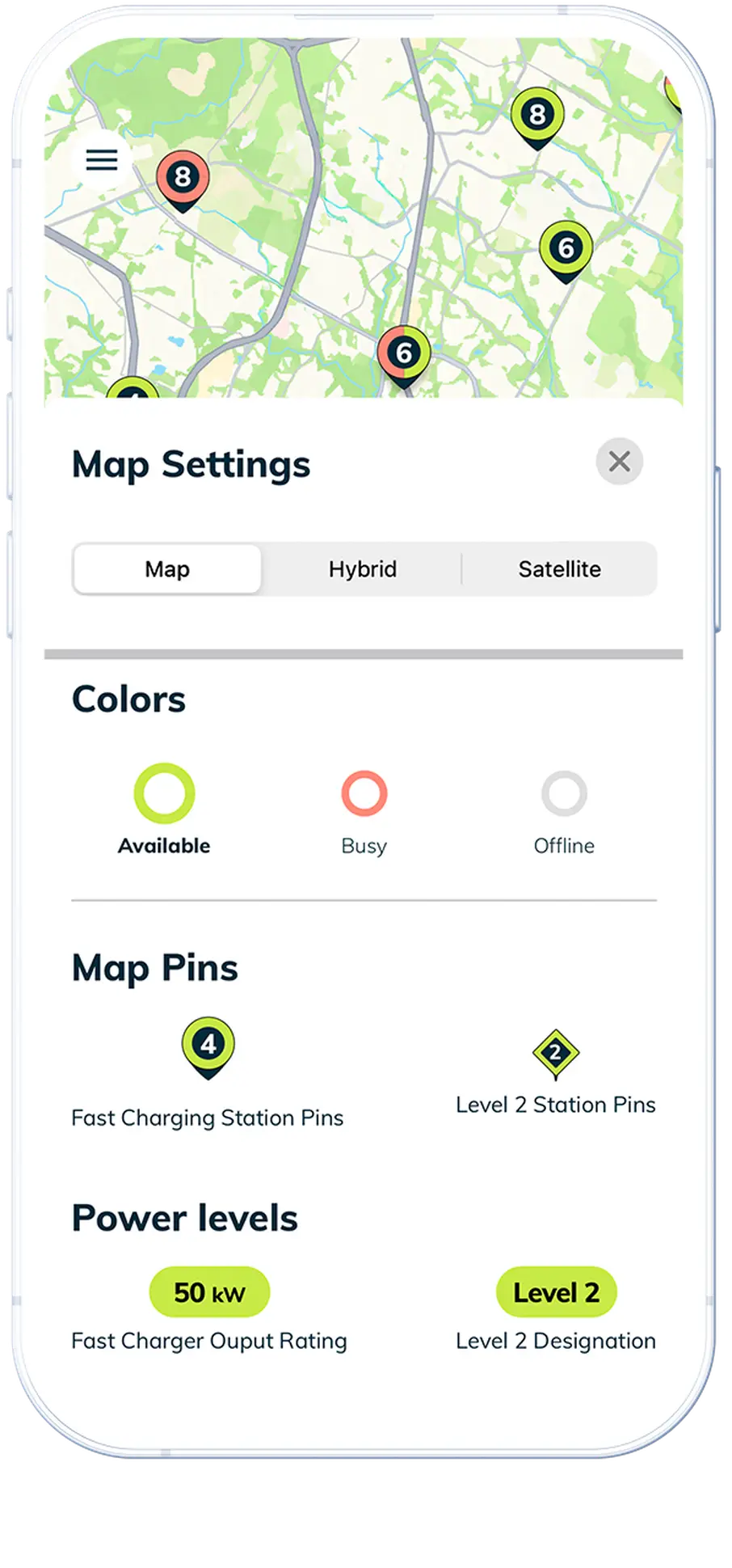
Design Implication: We needed to surface uncertainty-reducing information proactively. Connector compatibility, real-time availability, pricing, and expected duration needed to be visible before the user even arrived at the station. Claudia designed visual indicators that would make station status immediately apparent—green for available, red for occupied, with plug types clearly shown.
3. Optimize for Glanceability
Users interact with charging apps in chaotic environments: while driving, while parked at a station with glare on their screen, while managing kids or passengers, while walking back from a restaurant. The app needed to communicate critical information in seconds, not minutes, and meet drivers where they used the app.
Design Implication: Large, high-contrast typography. Color-coded status indicators. Minimal text. Icons with intuitive meaning. Information architecture that prioritized the most common questions. This principle would inform everything from button sizes to the live charging progress screen.
4. Respect Context and Time Pressure
Some users had all the time in the world; others were desperately trying to reach their destination. Many drivers were early adopters driving EVs that had pretty miserable range, so they were often stressed out by the time they pulled into the lot to charge. The app needed to serve both without forcing everyone through the same experience.
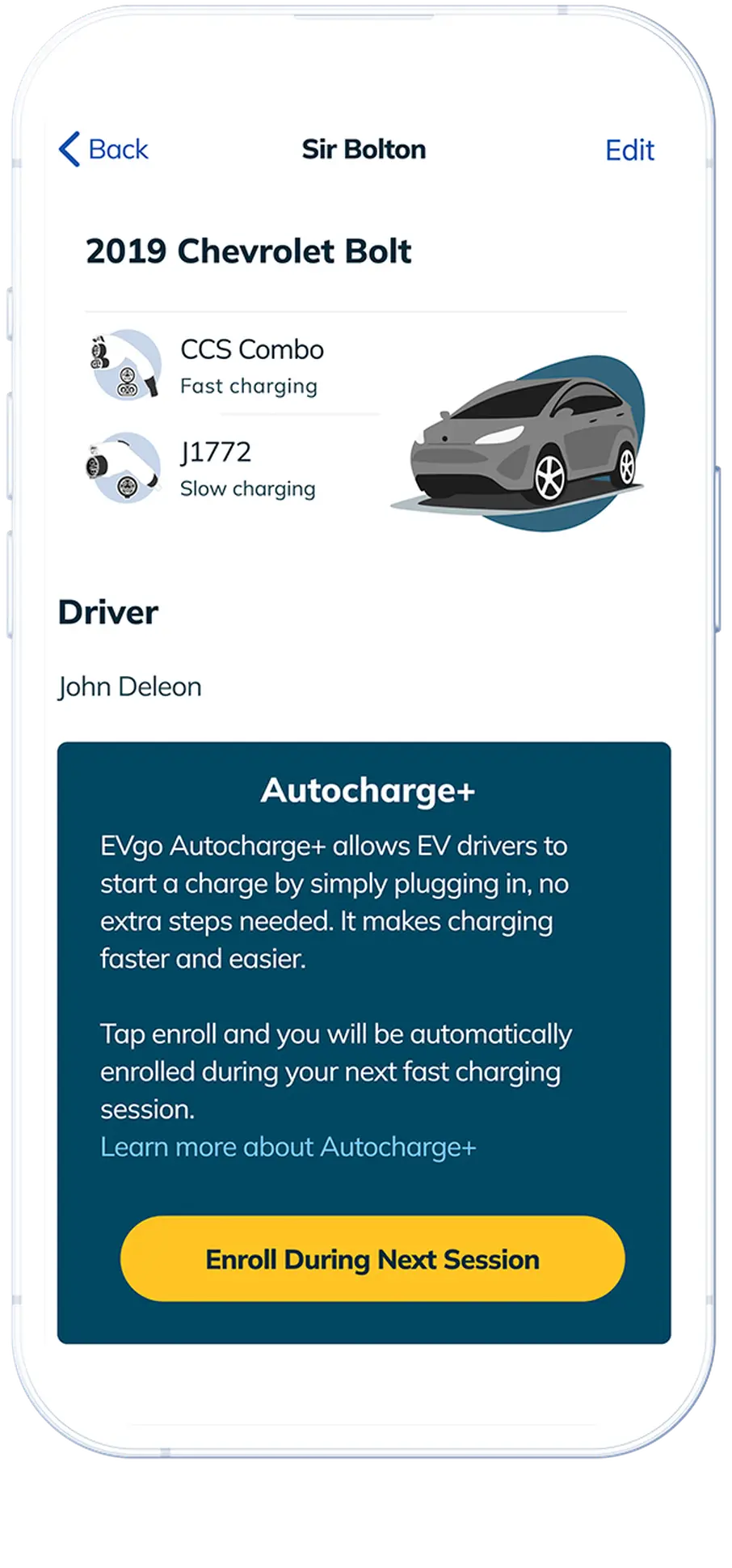
Design Implication: Default to the fastest path to a successful charge session, but allow users to explore details if desired. Quick start options, saved preferences, and one-tap session initiation for regular users. This eventually led to the development of Autocharge+, which would eliminate the app interaction entirely for enrolled users.
5. Educate Without Patronizing
The learning curve for DC fast charging was real, but users hated being treated like they were incompetent. First-time users needed hand-holding; experienced users needed efficiency. With 50% year-on-year growth in EV adoption, half your users are totally new to charging every year.
Design Implication: Contextual help that appeared when needed but could be permanently dismissed. Progressive onboarding that adapted to user behavior. Helpful hints that felt like tips, not lectures. Michael designed an onboarding flow that felt welcoming rather than condescending.
6. Build Trust Through Transparency
Users had been burned by unexpected charges, mysterious errors, and inconsistent experiences across different charging networks. Trust had to be earned through radical transparency.
Design Implication: Real-time pricing before session start, with time-of-use rates clearly displayed. Live charging status with updates every few seconds showing state of charge, charging speed, cost, and session time. Clear error messages that explained what went wrong and what to do next. Session receipts that showed exactly what was charged and why.
Phase 3: Ideate—Sketching the Possible
With our design principles established, we moved into divergent ideation. This phase is where IDEO's methodology really shines—encouraging wild ideas, building on each other's concepts, and deferring judgment.
Claudia and Michael facilitated structured brainstorming sessions with a cross-functional team: designers, engineers, customer support representatives, field operations staff, and even some of the users we had interviewed. We slowly hammered out designs for specific functions, building towards a whole. We also worked closely with the marketing team to adhere to brand guidelines.
Some ideas were obvious refinements of existing patterns:
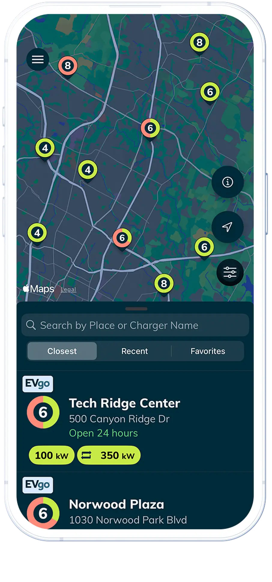
- "What if the home screen showed your closest charger with real-time availability?"
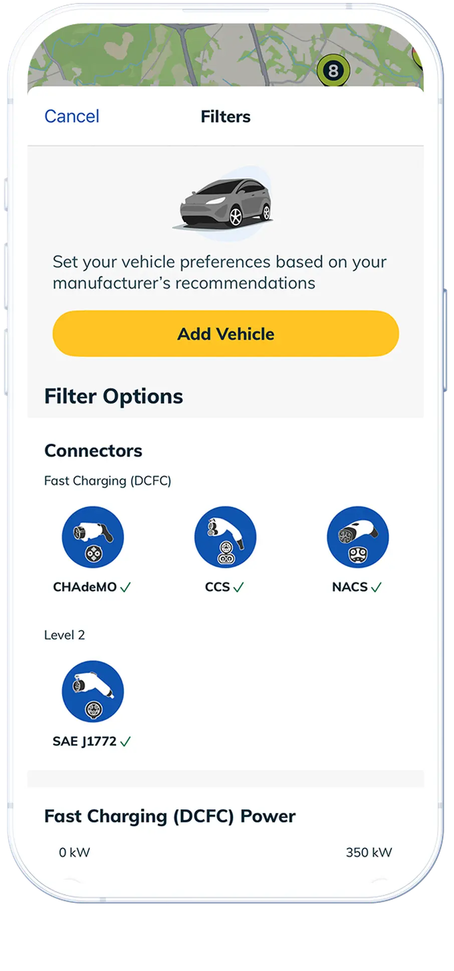
- "Could we add filters for connector type (CHAdeMO, CCS, NACS) and charging speed?"
- "What if users could scan their VIN barcode to automatically save their EV model and see only compatible stations?"
Some were more ambitious:
- "What if the app could pre-condition your route with suggested charging stops?"
- "Could we integrate roaming partners like ChargePoint and SemaConnect so users see 80,000+ additional charging locations?"
- "What if there were subscription plans with lower rates for frequent chargers?"
Some were technically challenging but user-centered:
- "How can we auto-start charging as soon as the cable is connected, without requiring the user to tap 'start'?" (Supporting EVgo's Autocharge+)
- "Could we send a push notification when charging is 80% complete, since that's when charging speed drops significantly?"
- "What if users start sessions with RFID cards or credit cards directly at the charger, not just through the app?"
And some were intentionally provocative, designed to challenge assumptions:
- "What if there were no buttons at all—just voice commands?"
- "Can we integrate with interfaces such as Amazon's Alexa?"
- "What if the app disappeared entirely and everything happened automatically through the car's systems?"
Claudia and Michael sketched relentlessly. Whiteboard sketches. Paper prototypes. Digital wireframes. The goal wasn't to design the perfect app yet—it was to explore the solution space fully before committing to an approach.
One particularly valuable exercise was "How Might We" statements, a classic IDEO technique:
- "How might we help users feel confident before they arrive at a station?"
- "How might we reduce the steps required to start charging to zero?" (This directly led to Autocharge+)
- "How might we make pricing transparent and understandable?"
- "How might we help users find the right charger for their specific EV model?"
- "How might we celebrate the environmental impact of choosing electric?"
These questions became lenses through which we evaluated every design concept.
Phase 4: Prototype—Making Ideas Tangible
IDEO's philosophy is "build to think"—create quick, low-fidelity prototypes to test assumptions before investing in high-fidelity development. We embraced this fully, with Claudia and Michael leading rapid prototyping cycles.
Interactive Prototypes in InVision and Figma
Next came digital prototypes with realistic visual design. Michael led the visual design system development, creating a cohesive aesthetic that felt modern, trustworthy, and accessible. We created interactive mockups in InVision and Figma that looked and felt like real apps. These allowed us to test more nuanced questions:
- Do users understand this icon?
- Is this information hierarchy clear?
- Does this animation communicate what's happening?
- Can users find this feature without hunting?
- Is the real-time cost update clear enough?
We took these prototypes back to EVgo headquarters to interview users. We ran structured usability tests with recruited users. We gave users specific scenarios:
"You're on a road trip and need to find a fast charger along your route to San Diego that works with your Tesla. Show me how you'd do that."
"Your charging session is complete but you're still eating lunch. How would you end the session remotely and see your final cost?"
"You want to understand why your last charging session cost more than expected. Where would you look?"
"You drive a Chevy Bolt. Can you filter the map to only show chargers compatible with your car?"
We used the "think aloud" protocol, asking users to narrate their thought process as they navigated. The insights were invaluable:
"I'm looking for a map... oh, there it is. But why are there so many pins? I just want the ones I can actually use."
"This says 'available'—does that mean it's working right now, or just that it exists?"
"I love that I can see the price per kWh AND an estimate in dollars. That's what I needed."
"Oh wow, I can save my car model and it automatically filters? That's genius."
Field Testing Beta Builds
Once we had validated the core flows with prototypes, we built increasingly functional beta versions of the actual app. But unlike traditional beta testing, we didn't just release it to volunteers and collect anonymous crash reports. We went back to charging sites with beta builds on test devices and watched real users attempt real charging sessions.
This revealed issues that prototypes never could:
- The "Start Charging" button needed to be absolutely massive because users were often tapping it while standing next to their car in bright sunlight with glare obscuring the screen.
- Status updates needed to happen more frequently than we planned because users would stare at the app, expecting immediate feedback that charging had begun. The live progress screen showing state of charge, charging speed, cost, and session time needed real-time updates.
- Error messages needed to include next steps, not just diagnostic codes, because users were stranded at a station with no idea what "Error 023" meant. We built in links to 24/7 live support and an in-app virtual assistant.
- The connector filter was a game-changer—users with specific plug requirements loved being able to see only relevant stations.
- Time-of-use rate previews before plugging in eliminated surprise billing anxiety.
We iterated relentlessly. Every Friday, we deployed a new build to our test group. Every Monday, we reviewed feedback and crashes. Claudia and Michael refined the visual design, improving contrast ratios for outdoor visibility, adjusting animation timing based on user perception, and polishing microinteractions. Rinse, repeat.
Phase 5: Test and Iterate—The Never-Ending Conversation
The IDEO framework suggests that testing is a discrete phase, but in practice, we learned that testing and iteration became a continuous cycle that extended long after launch.
Pre-Launch Validation
Before public release, we conducted a final round of comprehensive testing:
Accessibility Testing: We took advantage of tools to make sure color-blind and folks with visual and auditory impairments could use the app. Michael and Claudia's attention to WCAG compliance paid off here.
Stress Testing: We simulated challenging scenarios—slow network connections, spotty GPS signals, simultaneous user loads, edge cases like expired payment methods or session timeouts.
Multi-Vehicle Testing: We validated the experience across dozens of EV models, ensuring the VIN scanning and vehicle filtering worked correctly for each.
Competitive Benchmarking: We compared our design against other leading charging networks and adjacent industries (parking apps, gas station apps, mobile payment systems) to ensure we were meeting or exceeding expectations set by users' existing mental models.
Post-Launch Learning
When we finally launched the new EVgo app, we didn't consider the project complete. Instead, we viewed it as the beginning of a long-term conversation with our users.
We instrumented everything (while respecting privacy):
- Which features were most used?
- Where did users drop off in critical flows?
- What error messages appeared most frequently?
- How long did sessions take from app open to charging start?
- How many users enrolled in Autocharge+?
- What percentage of users saved their vehicle model?
We monitored app store reviews obsessively, not just for overall ratings but for qualitative feedback. We created a Slack channel where support tickets related to the app were automatically posted, ensuring the design team stayed connected to real-world problems.
Most importantly, we returned to charging sites regularly. Even after launch, team members spent time in the field, watching users interact with the app in real contexts. Design isn't something you do once and consider solved—it's an ongoing commitment to understanding evolving user needs.
The Transformation: What Changed?
The new EVgo app wasn't just visually different from the white-labeled predecessor—it represented a fundamental shift in philosophy. The app addressed user needs systematically:
From Generic to Specific
The white-labeled app was designed for charging networks in general. Our app was designed specifically for EVgo's network of 1,100+ fast charging stations across 40+ states, serving 1.4+ million drivers. This specificity allowed us to make smart defaults, provide contextual recommendations, and optimize flows for the most common EVgo use cases.
Intelligent Vehicle Matching
Users could now scan their VIN barcode or search by make and model to save their EV, then have the app automatically filter every charging map result to show only compatible stations. No more confusion about CHAdeMO vs. CCS vs. NACS—the app simply showed what worked for their specific vehicle, whether it was a Tesla, Chevy Bolt, BMW i3, Nissan LEAF, or any other battery-electric or plug-in hybrid vehicle.
Multiple Payment Pathways
We designed flexibility into the payment experience. Users could start sessions through the app, tap an RFID card, or use a credit card directly at supported chargers. Different users had different preferences, and we accommodated all of them. After I left EVgo, the team rolled out a very cool "Tesla-like" experience with GM vehicles: Autocharge+ for completely hands-free session initiation,
Reservations
Perhaps our most innovative feature was Reservations, which emerged directly from our research finding that users were willing to pay a premium to guarantee that they could access a charging station on their schedule. Once enrolled, users simply connected their EV and charging began. This represented the purest expression of our "respect context and time pressure" principle. No-show fees were also implemented, to help make sure we were not wasting charging utilization.
Transparent, Real-Time Pricing
We eliminated pricing anxiety by showing time-of-use rates before users plugged in, then displaying the session's EV charging cost updating in real time. Users could watch their spending during the session and see exact amounts on detailed receipts afterward. Subscription plans offered lower rates for frequent chargers, with clear savings calculations.
Live Charging Progress
The charging progress screen became a real-time dashboard showing state of charge, charging speed, cost, and session time—all updating live. Users could monitor from anywhere, perfect for those who wanted to shop, dine, or run errands while charging.
Expanded Network Access
While focused on EVgo's network, we integrated roaming partners ChargePoint and SemaConnect, giving users visibility into 80,000+ additional charging stalls—all from within the EVgo app. This addressed a key user need: finding a charger when EVgo stations weren't available.
Perks and Rewards
We built in the ability to unlock and redeem fast charging perks that came with qualifying electric vehicles from manufacturers like Cadillac and Toyota, turning the app into a value-delivery platform beyond just charging management.
24/7 Support Integration
Recognizing that charging issues often happen at inconvenient times, we integrated 24/7 support directly into the app, with instructional, swipeable carousels to help educate drivers. We provided easy access to email and phone support. Users never felt stranded by an app's dead-end.
From Reactive to Proactive
Our app anticipated needs by leveraging turn-by-turn directions to the nearest station from Waze, Google Maps, or Apple Maps. We also provided notifications when charging was complete.
From Transactional to Relational
Our app understood that EV charging is part of a longer journey—both literally and metaphorically. In our research we learned a significant minority of drivers paid a ton of attention to their charging spending and statistics. We showed patterns over time, celebrated milestones, and provided insights that helped users become more confident EV owners.
Lessons from the Trenches: What IDEO Didn't Teach Us
While the IDEO framework provided invaluable structure, actually executing a human-centered design process at scale taught us lessons that no graduate school case study could:
1. Organizational Buy-In Requires Evidence, Not Enthusiasm
Early in the process, some stakeholders questioned why we were spending so much time on research rather than building. "We know what users want—let's just build it," was a common refrain.
2. Perfect is the Enemy of Shipped
IDEO's methodology can become paralytic if you let it. There's always one more user to interview, one more prototype to test, one more iteration to run. In the end, you have to go with your gut and understand when designs are good enough to build, with the understanding that we'd continue learning and iterating post-launch.
We knew we would have a great shot to make a good impression at launch, so we cut the scope of features whenever we could to polish the app instead.
3. Cross-Functional Teams Need Translation Layers
Engineers and designers speak different languages. Customer support and product management have different priorities. The human-centered design process requires these groups to collaborate intensely, which means someone needs to translate between worlds.
We found that user stories became our shared language: "As a first-time user who is anxious about public charging, I want to see clear instructions before I arrive so that I feel confident I can successfully charge."
4. Quantitative Data Complements Qualitative Insights
The many hours we spent interviewing users gave us deep qualitative understanding, but we also needed quantitative validation. We A/B tested key design decisions, tracked conversion funnels, and measured session success rates. The combination of "why" (qualitative) and "how much" (quantitative) made us confident in our decisions.
5. Users Don't Always Know What They Want
A common mistake in human-centered design is treating user requests as requirements. Users are experts in their problems, not necessarily in solutions. When a user said, "I want more information on the home screen," what they actually meant was, "I feel uncertain and want reassurance."
Our job was to solve the underlying need (reduce uncertainty) rather than literally implement the requested feature (cram more information onto the home screen). We were challenged with identifying the need behind the request.
One example where we had a misstep was that our base of drivers were heavily Leaf and Bolt drivers. These vehicles could not take very fast charging, topping out around 54 kW for the pre-Ultium Bolt and 44kW for the first-gen Nissan Leaf. We would ask these folks what they thought about fast charging filters, and how we should represent them, and they didn't care. We went to Leah with our findings (as EVgo was rolling out much faster, more complex DC fast charging solutions), and she insisted that we needed to "skate to where the puck is going." Sometimes, your users can't see beyond their immediate challenges.
The Impact: More Than App Store Ratings
The success of the new EVgo app wasn't just measured in downloads or ratings. The real impact was seen in how the app changed user behavior and business outcomes:
Reduced Support Calls: Session initiation issues—a major driver of support contacts—dropped significantly because the app provided clearer guidance and better error handling. Autocharge+ essentially eliminated many support issues entirely.
Increased Session Success Rate: More users successfully completed charging sessions on their first attempt, reducing abandoned sessions and improving network utilization.
Higher User Retention: Users who adopted the new app showed significantly higher retention rates compared to those who had used the white-labeled predecessor. The 1.4+ million EVgo drivers represented a loyal, growing community.
Faster Session Starts: Time from arrival at station to charging start decreased dramatically, especially for Autocharge+ users who literally just plugged in and walked away.
Better Vehicle Compatibility: The VIN scanning and vehicle filtering features reduced instances of users arriving at incompatible stations.
Pricing Transparency: Complaints about unexpected charges dropped substantially due to upfront pricing displays and real-time cost monitoring.
Network Expansion Benefits: Integration with roaming partners expanded the effective network by 80,000+ stalls, increasing the app's utility without requiring EVgo to build more infrastructure.
Better Network Planning: The data we collected through the app—which stations were popular, when they were used, what vehicles were charging—helped EVgo make smarter decisions about where to expand infrastructure and when to schedule maintenance.
Conclusion: Design as Empathy at Scale
Leading the development of EVgo's mobile app taught me that human-centered design isn't a methodology you apply; it's a mindset you embody. The IDEO framework gave us structure, but the hundreds of hours spent with users gave us empathy. And empathy, scaled through thoughtful design, helps you see the world as your users do and find solutions to problems your users did not even know they had.
We didn't just build an app. We listened to anxious first-time users at charging stations in the rain. We heard the frustration of experienced EV drivers who just wanted things to work. We understood the needs of apartment dwellers and rideshare drivers who depended on EVgo's network as their primary charging source. We learned about the confusion around connector types and the anxiety about unexpected costs.
And then we designed a solution that honored their experiences, simplified their lives, and helped them embrace electric mobility with confidence. Together, we created something that helped hundreds of thousands of people interact with EV charging infrastructure, and we think we made that journey towards electrification a little smoother.